Project-First Navigation
Join is project management for the people who build actual buildings. As Head of Design, I lead a small team and ship product across the platform.
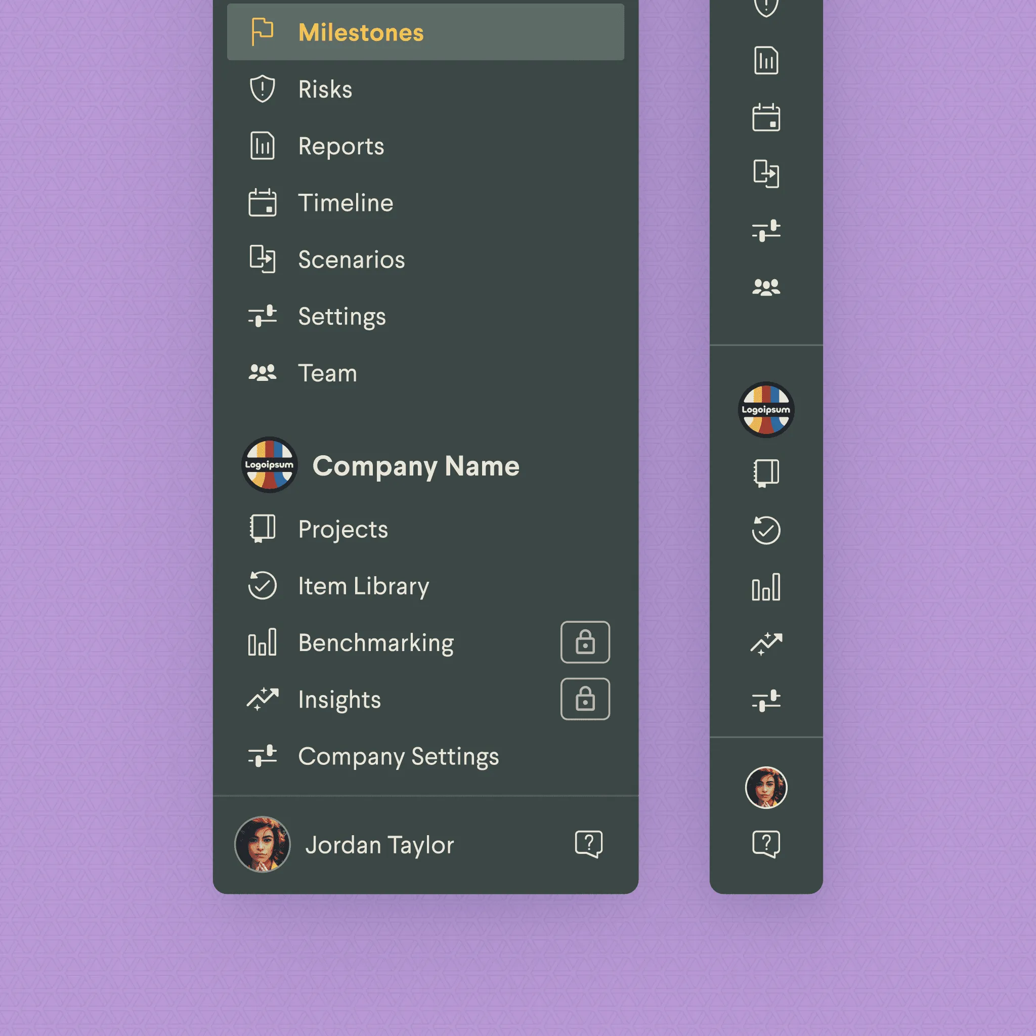
The new navigation rebuilds Join’s structure around projects. The old nav had grown feature-by-feature, with labels that drifted away from how users described their work. Customer success was fielding “how do I get to X” tickets, and usability sessions confirmed that users couldn’t describe Join’s structure in the product’s own terms — they described it in terms of projects. We rebuilt around that mental model and collapsed the path between any feature and the portfolio overview to two clicks.
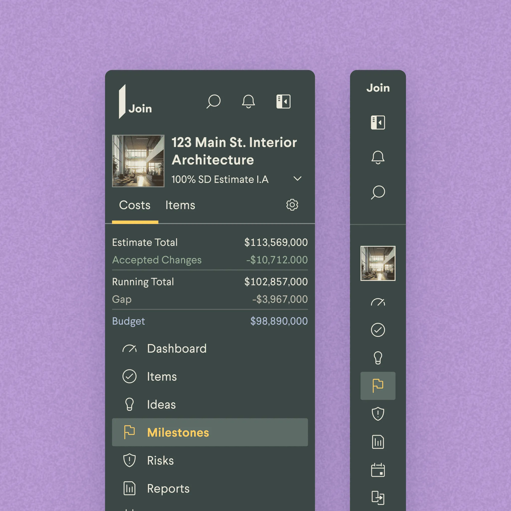
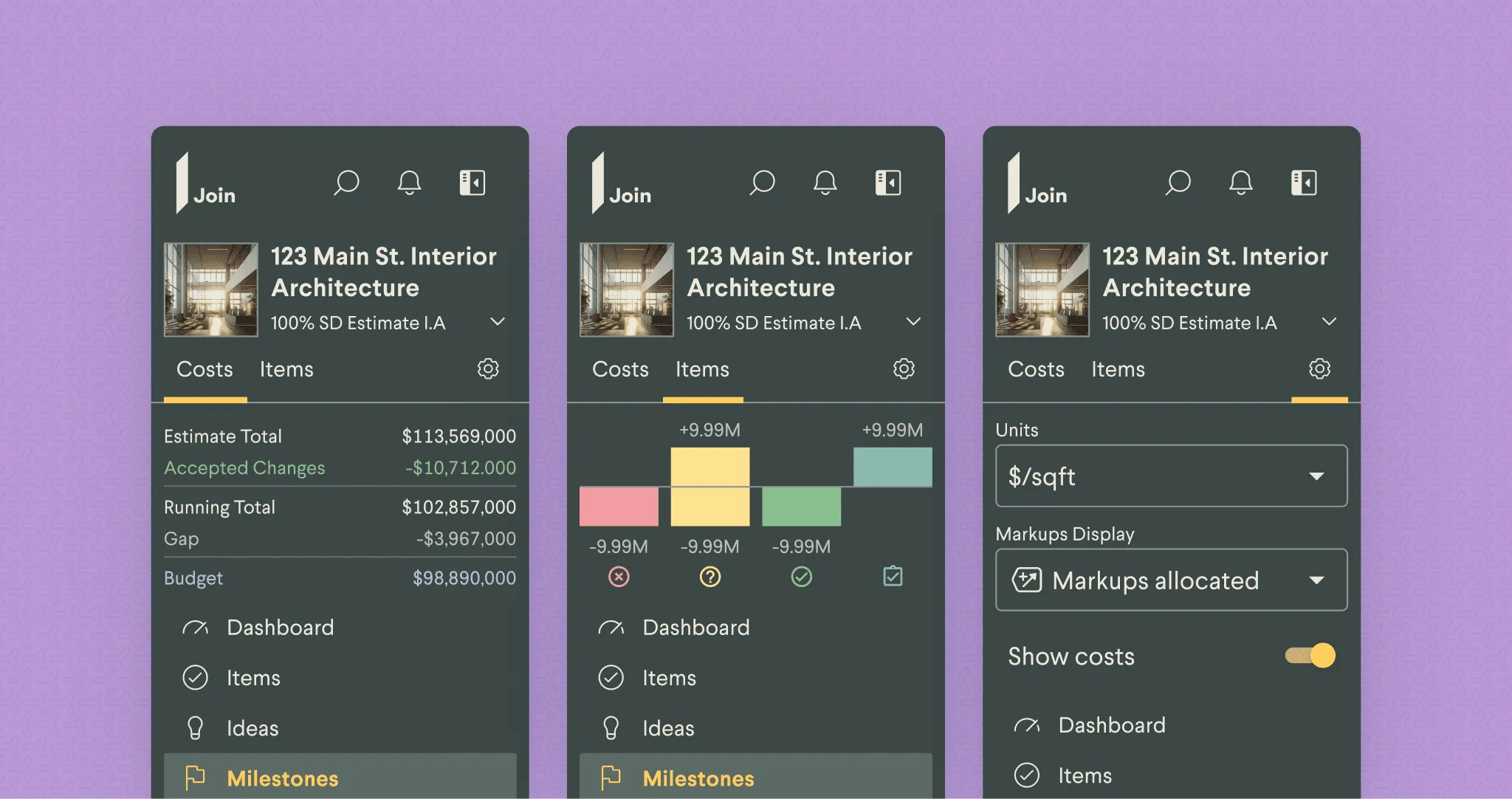
Projects as the top-level unit
The nav is the portfolio, then the project you’re working in. Features sit under the project, sequenced by phase — preconstruction features when the project’s preconstruction, change-management features when it’s in build.
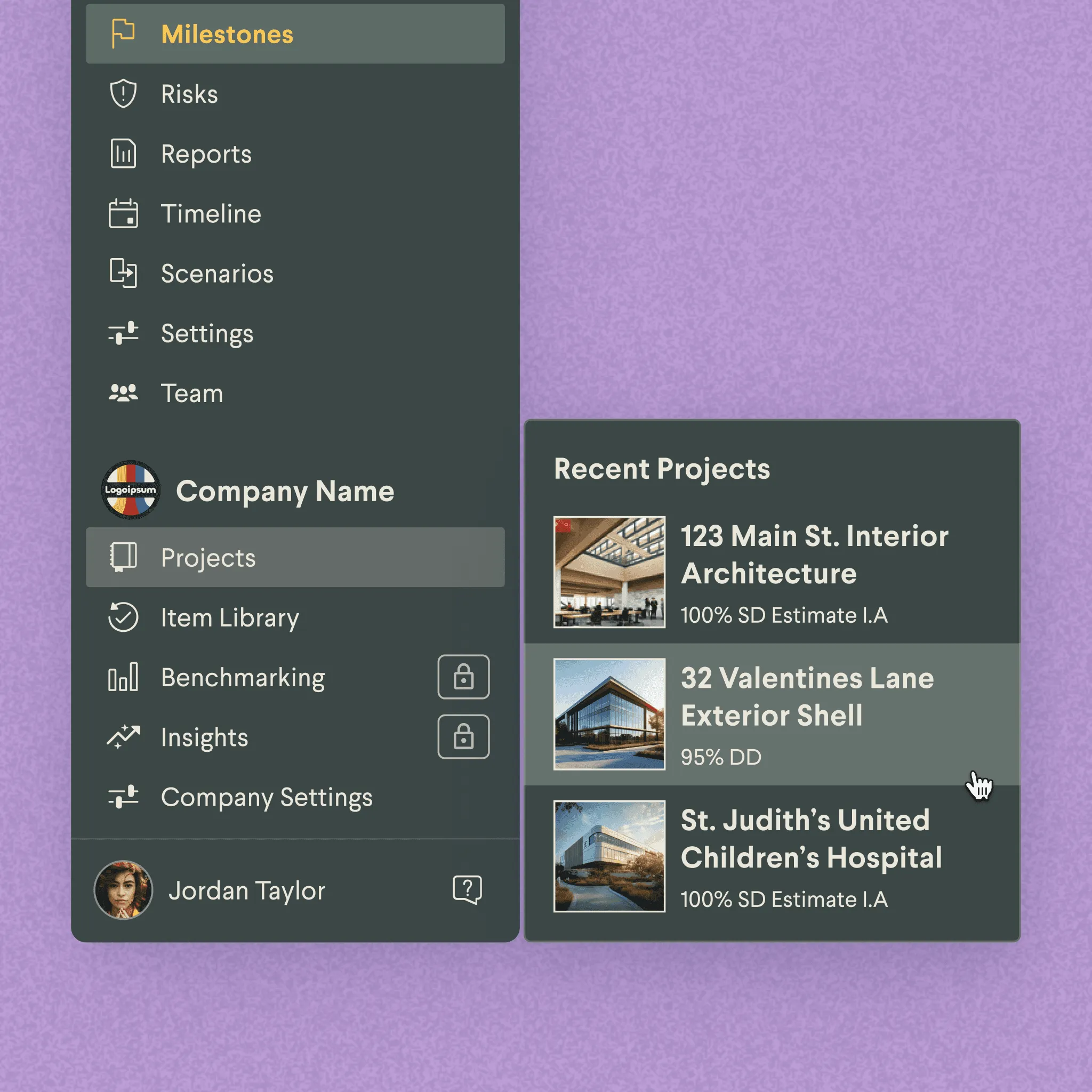
A two-click zoom
Two clicks down from the portfolio to any view inside a project, two clicks back out. The path is the same length in both directions, which made the zoom-out predictable for users who’d previously gotten lost coming back up.
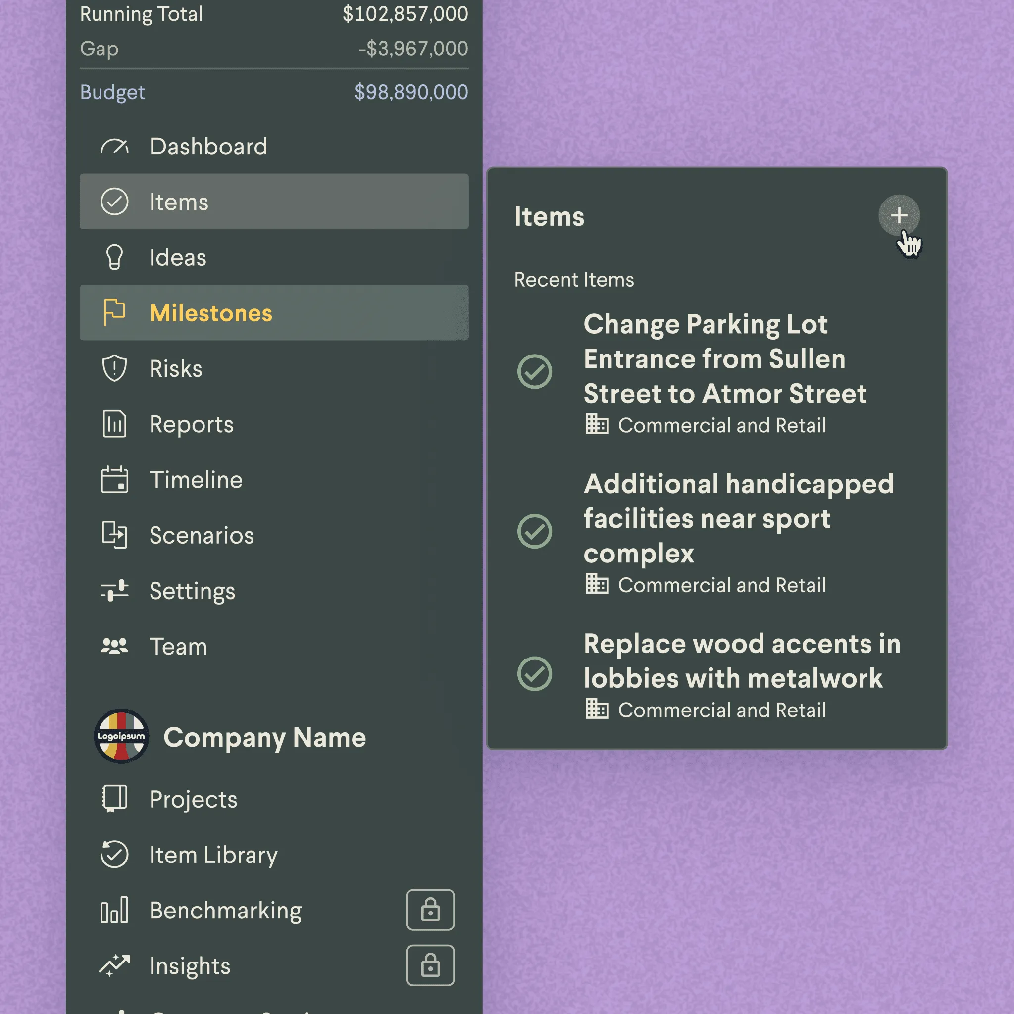
Features in their work context
When a project manager opens a project mid-build, the nav surfaces change orders and RFIs at the top rather than burying them under preconstruction tools used six months ago. Features appear in the context of the work that uses them.
Results
Support tickets on navigation questions dropped 32% after launch. Users started reaching for the org-level portfolio views in ways they hadn’t before. The zoom-out had been in the old nav technically, but the path back in wasn’t clear, so it sat unused.
“The team at Join is very brave for tackling this kind of UX issue.”
“So valuable for end users and their organizations as they will discover and use more of Join’s capabilities.”
Impact
32%
Reduction in support tickets post-launch
2 clicks
From any deep view to the portfolio overview and back